Task
To increase ridership on the CTA through digital means.

To increase ridership on the CTA through digital means.
Researcher & Lead UI Designer
User Research | Information Architecture | Design Strategy | Visual Design & Prototyping
My team and I conducted a few types of research methods to get down to the bottom of users’ problems with their experience using the CTA, and why they aren’t riding more.
We began by creating and sending out a google survey focusing on the physical aspect of riding the CTA, and the digital experience users have when navigating the transit system with mobile applications. We discovered a lack of awareness of the official transit app, and concerns about safety and timing.
We asked what people didn’t enjoy about the CTA in an open ended question, these were some responses:
“It’s crowded and overwhelming sometimes. […] and is dangerous at night (esp for ladies)”
“[…] if the tracker is off and leads me to miss the bus because the arrival time changed dramatically.”
“delays/gross men”

The team took to the streets to talk to and observe real CTA users. We asked them how they felt about the CTA, and we observed users interact with Ventra Kiosks and transit apps in real time.
In particular, we got amazing feed back from a CTA employee, and one interviewee who came back to tell me one of his very real concerns: the current inability to report problems in real time.
We also witnessed one user have no idea how to find the platform she was supposed to go to, saying:
“The sign doesn’t say what my phone says! Which stairs do I take?”

After gathering all our research and analyzing all our data, we noticed a few things:

After an ideation session with our peers, we came up with a few solutions to fulfill the users needs for safety, timing, and awareness:

But the physical solutions were out of our scope, leaving us with 3 solutions that fulfilled the business needs.
• Live User feeds
• Emergency Button
• Step by step directions with photos
Our analysis led us to 3 problems to solve for, and our ideation gave us the design direction to do so.
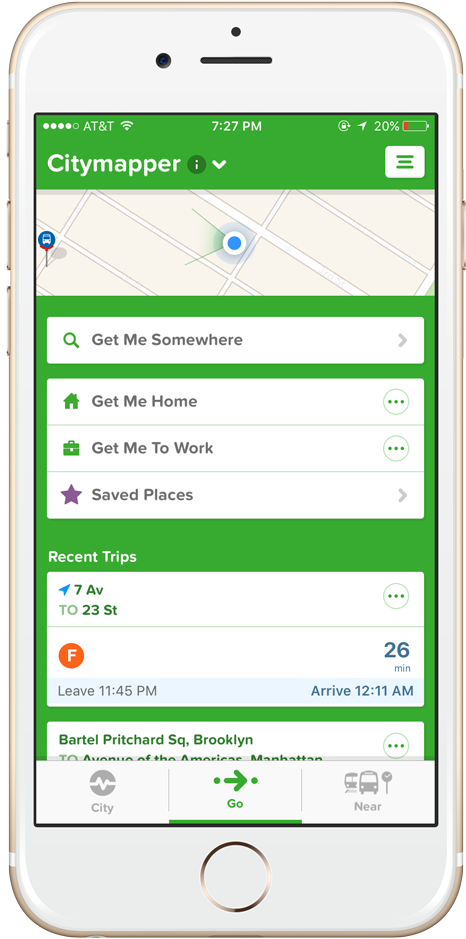
We also decided, based on business needs, to treat these solutions as new features in the existing Ventra app. It already allows for refilling your transit cards and accuracy in train schedules, it merely needed enhancements.
We began putting thoughts to paper and visualizing what these enhancements would look like.

We took these initial sketches and turned them into low-fidelity wireframes in the Sketch App, and then created a prototype in Invision.
We then user tested and found:

We incorporated this feedback into a second iteration and prototype, which included:
The second user testing went far better, with users saying things such as:
“…every phone should have this [emergency call feature]”
“I never realized i needed a detailed view until now, and I’m going to be really sad when I go back to using the real app later”
“This live feeds is great, would have really helped with that red line thing just the other day”
We did receive feedback about not requiring users to input name and contact info when reporting a problem (since they are already logged in).
Based on the feedback and our adjustments, we are confident that we’ve solved for users’ needs for:
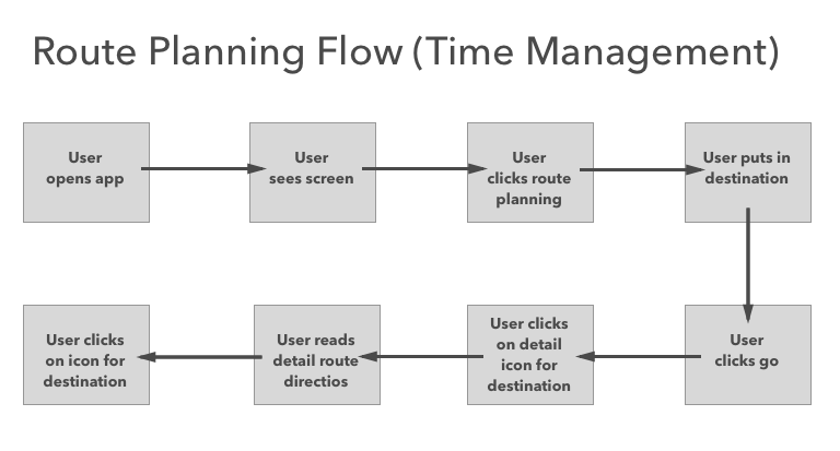
Users no longer have to worry about missing a train or bus.
User can now easily submit a safety concern directly to authorities.
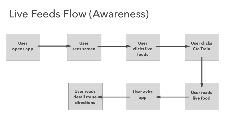
Users now have a constant and quick stream of real life updates from users like her.
Moving forward, we’d:


